


Grab Hold of Custom Mobile Web Design
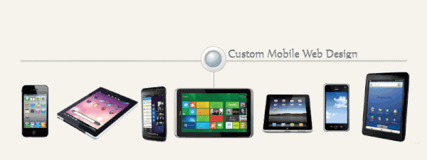
At Shaw, we specialize in building mobile websites that fit comfortably in the palm of your hand.
Have you ever accessed a website using your mobile phone only to find that it was so unfriendly and difficult to navigate you quickly lost interest? That website was not fine-tuned for mobile viewing.
With the majority of views soon to come from mobile devices, now is the time to prepare your website. Call Shaw Website Design Group to help tailor a design that fits your needs, your budget and is mobility aware.
We Offer Three Distinct Options for Delivering a Mobile Experience
Standard Mobile Integration Using A Separate URL
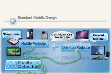
Beginning our standard mobile integration involves first creating a seperate, mobile version of your current website.
Linking up to this new version requires a modification to your current websites logic that recognizes what type of device is trying to access its content. This logic will direct either the older, non-mobile webpage to load or call for a re-direction to the newly designed mobile version.
The mobile website is a scaled down version of your main website. It will not contain the same content and it will be arranged differently. This will ensure quick load times and a successful user experience for the mobile customer.
Responsive Mobile Website Design That Uses A Single URL.
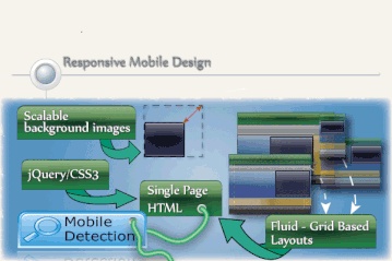
Responsive web design is a new approach to web design in which a website is built to provide an optimal viewing experience, regardless of how the visitor has accessed the website.
The website will literally respond and adapt to the device whether it is a desktop PC, smart phone or tablet. These new features enable you to optimize your site experience across different screen sizes without creating multiple websites.
With flexible templates, CSS and jQuery, a responsive site immediately adjusts images, template layouts and content according to the screen size of a device.
We use a single URL that makes it easier for your users to interact with, share, and link to the websites content. There is no redirection for users to get to the device-optimized view, which can reduce load times. In order to create a truly great experience with a responsive mobile website, businesses need to have device specific strategies and design web content with the end user in mind.
Dynamic Mobile Website Delivering Custom Webpages on the Same URL
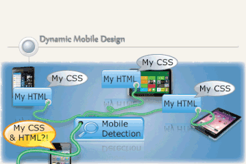
Responsive mobile design allows for lightning fast load times and a complete utilization of a model specific design.
Layouts with seperate HTML pages are created on the same server for each model requested. This type of focus ensures that speed is optimized for that device and server use is lowered due to the fact that the webpages are smaller.
If in the future you decide to change phone models or add a new design, it is just a matter of creating new layout pages for that specific model to use.
Unfortunately, there is a down side for the added page speed. Due to the fact that every device requires a separate page, code must be written and maintenance will have to be performed periodically as model updates are released. This will increase labor costs, but if speed and model specific features are your priorities then the labour cost will have to take a back seat.
 Return to our home page
 Need to contact us?
 Back to services
 View more resource
bubbles
View more resource
bubbles Have you seen our Pearltrees?
 Join us on Google+
 Follow us on Twitter
 Visit us on Facebook
 Visit our Youtube Channel
Search the Site